
CONNECT PHYSICAL THERAPY
The color palette, a soothing blend of earthy tones and vibrant accents, reflects the nurturing environment of CPTs care and the dynamic energy of the healing process. From tranquil blues that evoke a sense of calm to invigorating greens that symbolize growth and renewal, each hue serves as a visual reminder of the transformative power of pelvic physical therapy.

SUMMER GAMES COMPETITION
A warm, fiery gradient that goes from dark at the top to a brighter orange at the bottom, with sparks and embers floating upwards, which adds to the dynamic and energetic feel of the brand. This is used for a sales competition. BRING THE HEAT!

TEAM GAMES COMPETITION
The wolf's head is highly stylized with sharp, intricate linework, and a fierce expression, suggesting a sense of aggression or intensity. This is used for a sales competition.

BATTLE ROYALE
The choice of colors suggests a stark contrast, emphasizing the dramatic and intense nature of the brand. The use of red against the neutral tones of white, gray, and dark brown/black creates a visual impact that is striking and memorable.


LOGOS & BRANDING
additional logos


presentations
Rank Presentation
Club Presentation
Lead Gen
Culture Deck

Print media


BOOK LAYOUT AND DESIGN


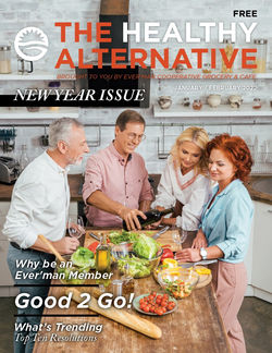
MAGAZINE LAYOUT
The Healthy Alternative is a Co-op based magazine that was printed in quantities of 20,000 for every publication.
You may click the cover of the magazine and view it in its entirety.
 |  |  |  |
|---|---|---|---|
 |